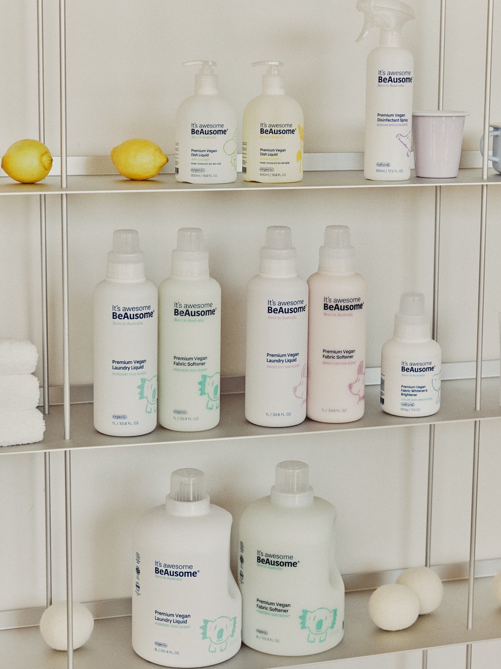
Beausome Brand Renewal
The original Beausome identity often caused confusion—appearing either as a cosmetic label or a baby-only brand.
Packaging lacked readability, while graphic and color choices clashed
with the brand’s core value of organic, nature-inspired products from Australia.

Repositioned the brand from a “baby-focused” look to a comprehensive family & lifestyle identity.
Developed a unified visual system across logo, packaging, and graphic elements.
Enhanced consumer clarity while reinforcing Beausome’s natural and eco-friendly values.